 Marketing
To Optimize Your Landing Page, Don’t Forget About FONZIE
From 1974 to 1984, “Happy Days” ruled the airwaves as one of the highest-rated shows of the 70s. The show originated in a time when nostalgia for the 1950s was at its peak—hot rods, malt shops, sock hops, drive-ins and the like.
Who would have thought it would be relevant in online marketing, too?
A huge part of the show’s wild success was its cast—most notably, Henry Winkler’s portrayal of Arthur “Fonzie” Fonzarelli, a wise-cracking, leather-jacket-wearing greaser who stood up for the show’s lilly-livered protagonist, Richie Cunningham. By telling the bullies and punks at Jefferson High School to “sit on a tack” or to “take a long walk off a short pier,” the Fonz was cemented in history as the paradigm of tough guy-ness. (And in 2008, he really was cemented in history.)
As inbound marketers, we’re always on the lookout to make our landing pages a little better. Converting visitors into fans is tough work, and landing pages are usually the linchpin that holds the whole process together. That’s why optimizing that content—and the whole landing page process—is a tenuous task.
That’s why we call in our friend Fonzie to help us out.
At Flying Hippo, we use the acronym “FONZIE” to give us a rubric of what a great landing page needs. By asking these five questions every time we make a new landing page, it’s easy to ensure the page is “correctamundo.”
What’s the Focus?
Your landing page should have one focus. Not two or three or none—only one thing that you’re encouraging your visitor to do.
When you have that laser-guided focus, it can be tricky to create content. You have to be enticing and give some of the content away, but you need to leave the reader wanting more. A great landing page describes the focus of the gated content piece without giving too much away.
The more slim the focus of your gated content piece, the more likely you are to hit your target persona.
In short: Narrow your landing page’s focus to eliminate what you don’t need and emphasize what you do.
Is the Offer Overt?
When you create a landing page, you’re enticing viewers to do one thing. And the more clear and precise you make your offer, the more likely you’ll have a happy audience.
For instance, if you pepper your page with buttons and graphics saying “Download now!”, they should receive a download link—nothing more, nothing less. When you over-promise and under-deliver, you’re going to let your audience down, and it’s not a good idea to disappoint fresh new leads.
In short: Be upfront and honest about what your audience will receive if they follow through with your landing page’s offer. Don’t disappoint!
Is the Design Nimble?
In 2014, we passed the “mobile tipping point.” More people are accessing the internet on mobile devices then they are on desktop (or laptop) computers. So why they heck are we still not designing for mobile devices first?
First things first: If your landing page doesn’t work well on a mobile site, everything else is moot. No matter how enticing your content is, mobile users won’t struggle and squint through a non-responsive landing page.
And if your landing page works well on a mobile device, does the design guide visitors to convert, or does it lead them astray?
In Short: Your landing page’s design must be responsive, and its design must visually guide viewers to convert.
Is it a Spotted Zebra?
Here at Flying Hippo, we spend a lot of time talking about Spotted Zebras.
When you’re a spotted zebra, you stand out from the pack. And that’s precisely what a landing page should do: bring together visual elements in a unique way that gives your visitors practically no choice but to fill out your form.
Branding is a huge, unavoidable part of every page on your site, and that goes double for landing pages.
In Short: Make your landing page’s design a Spotted Zebra: a seamless extension of your brand that entices visitors to follow through.
Does it Intrigue?
If you could boil a landing page down to one type of movie genre, it would be film noir. Like these classic Hollywood crime dramas of the 1950s, your landing page should keep you on the edge of your seat, riddled with intrigue, wondering what comes next.
The mix of content and design on your landing page should entice and intrigue your audience, not give away everything they’d read inside. Keep your content short and simple.
Think of a landing page like the tip of the iceberg: it gives away a clue of what’s going on underneath without revealing the enormity of what’s beneath. To find the right fit, you might have to test a few iterations of your landing page
In short: To intrigue your visitors, give away just enough information to bring them in. Leave them wanting more—and point them toward the next step (downloading your content).
Are we Enthusiastic?
Imagine Fonzie on a bad day: the jukebox won’t play his favorite song, his motorcycle won’t start, the bullies took over Arnold’s Drive-In and he got a D- on his math test.
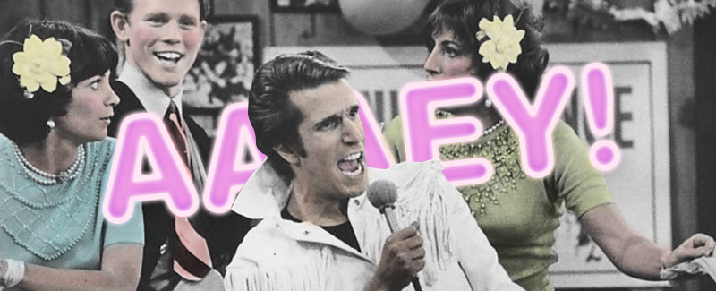
He’s phoning it in: his usual two-thumbs-up greeting “ayyyyy!” has been replaced by “eh,” with a shrug of the shoulders. He’s just not the same Fonzie without his characteristic enthusiasm.
If your landing page’s content doesn’t convey the same enthusiasm you want your visitors to feel, you’re missing out on a huge opportunity. When you’re enthusiastic about the content on the other side of a landing page, your readers will be too!
In short: Keep up the enthusiasm in your writing, and your visitors will notice.


