 Marketing
Effective Calls To Action: Just Do It
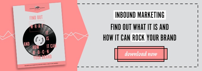
This blog is about effective “Calls To Action” (or CTAs for short.) You know what calls to action are. You’ve seen them, and you’ve probably clicked on them, yourself. They’re the buttons that appear on landing pages all across the world wide web. They’re a big part of your inbound marketing plan, and, simply put, these buttons are the driving force between what makes a viewer a qualified lead. When a user clicks on a CTA, they’re giving you permission to market to them. As a matter of fact, when done right, potential customers will be giving you plenty of information about themselves to make marketing to them even easier.
Here are some best practices to keep in mind when creating effective calls to action for your marketing implementation.
THE MESSAGE
Since the purpose of a CTA is to get a user to complete another step or take the next action in a workflow, it’s always important to make sure that the call is action-oriented and that the copy used is clear and concise. The best calls to action are based around direct action verbs. Whether it’s signing up for a blog subscription, filling out a form to receive a hot new piece of gated content or just driving a user to contact you, the message should be clear enough so that your user is not confused in the slightest. The simpler the terms, the better.
Obviously, when deciding what terms to use in your CTA, you should keep in mind the audience that you’re talking to. You’ve spent all that time designing your ideal personas, why not direct the message to them in their language? And, since you’ve also invested resources in coming up with an awesome keyword strategy, you’ll want to be sure that your CTA is using the same keywords as your landing pages, forms and thank you pages. Being consistent with your keywords and language used through all stages of the buyer’s journey will not confuse your potential lead. They’ll know exactly what they’re signing up to receive.
THE DESIGN
You can have the best phrased CTA in the world, but, if people can’t find it easily, it’s a worthless call. That’s why the best calls to action are designed to be attention-grabbing. Your CTA needs to stand out from the rest of the page so users know where they need to click. But, how should they be designed so they do stand out? Should they be big and bold or should they be clean and minimal? The answer to that is to go back to your buyer personas, again. Think about what makes them tick and how they like to use their websites. You’ll also want to make sure that the CTA is a natural fit with your brand and your site, so be sure to use colors and design elements that complement what your team already has in place. Successful CTAs always look like they are natural page elements and never look like they have just been slapped onto a page.
THE PLACEMENT
Where your CTA lives on your site should also be a big part of your strategy. If you decide to place your CTA above the fold, it will be one of the first things visitors notice when they click on to your website. Whether your CTA will live at the top of a page or the bottom of a blog post, you’ll always want to make sure that your CTAs are posted in a place that is directly related to the content. A CTA for a blog subscription doesn’t belong on a page that lists your suite of services and pricing, right? The more suitable place for that would obviously be at the bottom of a blog entry or on your blog page.
You could also consider placing your CTAs in the sidebar. Sidebars are great places to get your users attention. They are also an awesome place to provide an additional offer that’s supplemental to what they are already reading, and interested in. Be sure, however, to keep these a little more generic so they appeal to a wider audience.
YOUR CTA IS CALLING
You’ve created what you believe to be your best call to action, and you think you’ve chosen the best places for them to live, but your job isn’t done yet. After all, what good is a CTA if no one is clicking on it? You want to be sure that your CTA is effective and that it is generating results. That’s where testing and analyzing come in. According to Hubspot, a good goal to strive for when it comes to a CTA is a 1-2% click-through rate, whereas 10% is a good standard for a CTA’s clicks-to-submission rate. If your CTA is not performing as you’d like, feel free to change it up, but only change one component at a time. As you continue to test and analyze, you’re sure to come up with a CTA that is effective for your marketing efforts.
When implemented correctly, CTAs should play a huge part in scoring quality leads for your company, and keeping those leads engaged as they travel down the sales funnel. They should stand out, be well placed and be easy to understand based around action-oriented verbs. I did spend some time gathering some CTAs that stood out to me so I could post them here at the end of the blog. Instead, though, I’m leaving you with this. It might be a little crazy (or, a lot, depending on your take on this once Hollywood A-lister.) I think it’s the video equivalent of an effective CTA. When you’re done watching, you may be giggling a little. You might even be shaking your head saying ‘WTH?’ One thing for sure, though, is you know what the call to action is.
So, what are you waiting for? JUST DO IT!


