 Web
Web
6 Ways Bad Website Navigation Can Tank Your Marketing

By Ryan Parlee
Visiting a recently-remodeled grocery store is a disorienting experience. You went there once a week for years, and now everything’s new and shiny—but nothing is where you expect it to be.
Where the deli once was is now the seafood counter. The bread isle is now a salad bar. And heaven knows where the eggs are now—probably over where the candy used to be. You have to allot extra time to just navigate the place and figure out where all the staples are located. (And Lord help you if you’re in a rush!)
Websites are similar to grocery stores in a lot of respects. People come in the front doors having an idea of what they need, and use signs to figure out where the popcorn or cheese is. (Or, if you’re a repeat customer, you head right to the aisle without any assistance.) On your site, people use menus and other website navigation cues to get around, too.
After all, there’s a reason they put those candy bars right by the register: they know navigation matters to sales and marketing. Avoid these pitfalls to streamline your sales.
Non-Standard Menu Location
A huge chunk of website navigation is just having things where people expect them to be. Which is really pretty simple if you think about it. Don’t try to reinvent the wheel, just give people the information they’re looking for in the place they want it.
Some sites put a menu in the middle of the page, or in an awkward part of the header. This should be avoided.
Generic Menu Labels
Let’s say you run an online store that sells running shoes. Since most people come to your site to buy, compare the prices of, or look at running shoes, it would make sense to put titles such as these in your menu:
- Men’s Shoes
- Women’s Shoes
- Socks
- Clothing
For an online running shoe store, a bad menu design would skim over the reason that people are at the site to begin with to switch the focus solely on them. A crummy menu might look something like this:
- Who we are
- What we sell
- Why we sell it
Most viewers don’t come to your site to waste time. Streamline your website navigation and get to exactly what they want.
Too Many Items
Here’s a menu of an auto parts store that’s just jam-packed with every possible option:
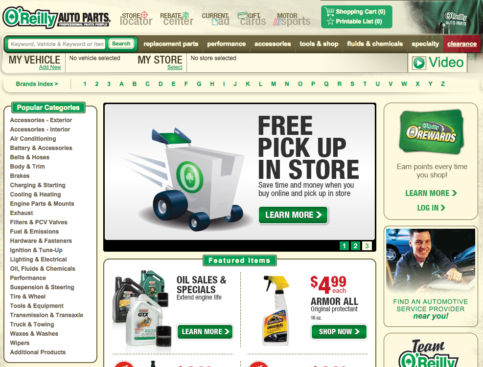
The “popular categories” menu on the left side of the page is far too long. That information could easily be on the top menu, but instead, it’s taking up space in the main part of the page. Too many options give your customers too many opportunities to get flustered and leave.
External Links
Your menu system is how your customers can navigate your site and find what they want. You want them to choose you, not your competitor. So why does your menu system use buttons instead of links? Buttons are a bad choice for your navigation for several reasons. The text within the buttons you create is invisible to search engines, making them less search engine friendly. Buttons also load slower than links, and are harder to update.
Ignoring Short-Term Memory
Do not expect your visitors to memorize where the important buttons on your site are. We know that when quickly browsing a website, our short-term memories can only remember seven items. Ignoring short-term memory and putting more than seven items within your menu is a mistake that could lead your visitors away from the important places on your site. The fewer navigation options there are, the less likely it is to have your visitors scan over the important links on your site.
Think Analytics
Figuring out where your visitors are going on your site is important to understand if your layout is effective. If you have analytics software that allows it, check out the conversion assists report. This will show you the most commonly viewed pages among people who turned into customers. Google Analytics also provides a lot of good information about where your traffic is going if you’re not running any other analytics software.